Skip to content

Introduction: Why Color Matters in Swimwear
Struggling to find a swimsuit color that flatters your skin and actually looks great in daylight and photos? This swimwear color guide shows how the right shade boosts glow, sharpens definition, and builds confidence from the fitting room to the pool.
This guide covers Warm vs Cool Tones, Contrast Levels and Skin Compatibility, and Prints vs Solids, helping women who feel unsure pick colors that brighten skin, improve visibility, and pair easily with their wardrobe.
Warm vs Cool Tones

Warm tones in swimwear include colors like earthy reds, oranges, yellows, and golds, suited for skin with yellow or golden undertones. Cool tones feature blues, purples, and icy shades, ideal for skin with pink or bluish undertones. Choosing the right tone enhances natural glow and creates flattering contrast.
Use this swimwear color guide to match warm and cool tones to the right complexions. In our experience, a focused palette helps shoppers find a confident fit and reduces guesswork.
Identifying Skin Undertones (Table)
| Skin Undertone | Indicators (Vein / Sun / Metal Test) | Best Swimwear Colors | Colors to Avoid |
|---|---|---|---|
| Warm | Veins appear green; tan easily; gold jewelry suits best | Burnt orange, olive green, mustard yellow, coral, bronze, gold, mocha, taupe, amber, peach, cappuccino | Icy tones, pastel blues, cool grays, true white |
| Cool | Veins appear blue or purple; burn easily; silver jewelry suits best | Sapphire blue, emerald green, ruby red, plum, lavender, powder blue, icy pink, bright white, navy, charcoal | Earthy browns, oranges, yellows, golds, warm reds |
| Neutral | Veins not clearly blue or green; burn and tan equally; both metals suit | Can wear both warm and cool colors; widest variety | None specific, but contrast is key |
Color Theory and Seasonal Typing
- Warm undertones glow in the warm half of the spectrum: peach, coral, golden brown, terracotta.
- Cool undertones shine in the cool half: sapphire blue, lavender, icy pink, dusty blue.
- Winter and Summer are cool seasons that favor jewel tones and pastels.
- Spring and Autumn are warm seasons that prefer earthy, vibrant, and golden hues.
Benefits of Matching Swimwear to Undertones
- Enhances the natural skin glow and complements each complexion.
- Creates flattering contrast and avoids washed-out looks in photos and real life.
- Reduces returns by guiding shoppers toward harmonious color choices that feel right.
- Neutral undertones have flexibility, but contrast remains important for visual impact.
Why Choose Us for Color‑Perfect Swimwear
- Pantone‑matched dyeing and digital sublimation for vibrant, consistent hues across sizes and lots.
- Advanced, chlorine‑resistant and UV‑resistant fabrics that keep color integrity season after season.
- Rapid sampling and low‑MOQ pathways to test warm vs cool palettes without inventory risk.
- Custom prints, trims, and logo applications to align color stories with your brand vision.
- Rigorous QC and global compliance (BSCI, OEKO‑TEX) to ensure quality you can scale.
Contrast Levels and Skin Compatibility
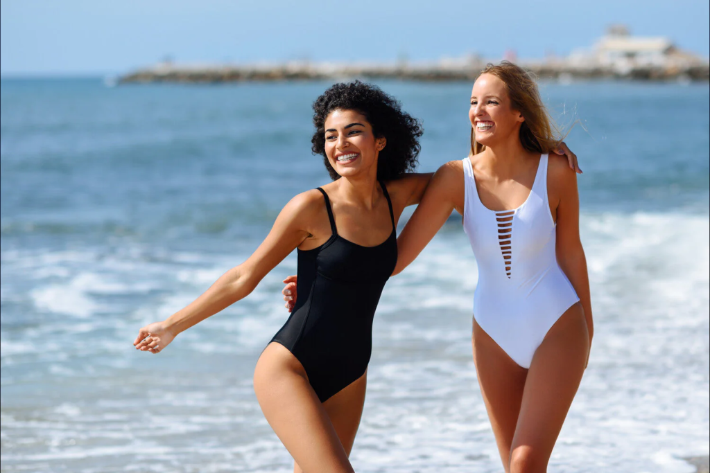
High-contrast neon colors such as neon yellow, neon green, bright orange, and fluorescent pink offer superior visibility and contrast for swimwear, making them safer and flattering for many skin tones. Muted or dark tones reduce visibility and do not complement all complexions well.
Use this swimwear color guide to balance safety and style. In our experience, smart color contrast boosts underwater visibility while still flattering your undertone.
Swimwear Color Visibility: High vs Low Contrast
| Color group | Pools | Lakes | Notes |
|---|---|---|---|
| Neon yellow / neon green / bright orange | High visibility | High visibility | Neon yellow reflects 2x vs standard yellow; stands out in clear and murky water. |
| Fluorescent pink / bright red | Strong in pools | Variable in lakes | Pink pops against blue tiles; sediment can mute red at depth. |
| White / light blue / pastels | Often blends | Low visibility | Surface glare makes white fade into reflections. |
| Black / navy / gray / dark green | Low visibility | Low visibility | Dark tones merge with depth and shadow below the surface. |
Skin Tone Compatibility with Swimwear Colors
- Cool skin tones: sapphire blue, emerald green, ruby red, icy shades, charcoal grey, cool white.
- Warm skin tones: peach, coral, turquoise, sunny yellow, burnt orange, olive, camel, forest green, terracotta.
- High-contrast (winter) types: black, white, navy, icy blues, ruby, cool greys for crisp definition.
- Low-contrast (summer) types: rose, lavender, dusty blue, pastels for softer balance.
- Neon colors: universal visibility and often crowd-pleasing; test shades to match undertone and brightness level.
Benefits of High-Contrast Neon Swimwear
- Fluorescent dyes reflect more ambient light, improving recognition underwater and in mixed lighting.
- High visibility helps spot swimmers faster during play, training, or supervision.
- Lifesaving gear often uses neon orange/yellow because it stays conspicuous across distances and backgrounds.
- Neon hues stand off against pools, lakes, and surf better than dark or muted tones, supporting safer choices.
Why Choose MLY Apparel for Color‑Accurate Swimwear
- OEM/ODM/private label support from fabric R&D to delivery for fast launches.
- Pantone‑matched dyeing and digital sublimation for vibrant, long‑lasting neon shades.
- Performance fabrics with chlorine resistance and quick‑dry comfort engineered for swim.
- Low MOQ pathways for testing colorways, plus scalable mass production when you’re ready.
- Compliance with BSCI and OEKO‑TEX standards and recycled options like ECONYL/REPREVE.
Prints vs Solids
Prints offer greater visual variety and trend-driven appeal in swimwear, while solids remain the top choice for versatility and timelessness. In 2024, solid-colored swimwear fabrics held the largest market share at 38.4%, reflecting strong consumer preference for classic looks.
This swimwear color guide compares printed and solid fabrics across demand, styling, fit, and retail risk. In our experience, most shoppers start with solids for confidence, then add prints for personality. Brands see traction when they balance both.
| Aspect | Prints | Solids |
|---|---|---|
| 2024 Market Share | 34.2% of global swimwear fabrics | Leader at 38.4% share |
| Consumer Appeal | Trend-driven, seasonal, bold designs | Timeless, easy to mix-and-match |
| Styling Versatility | Lower; needs careful pairing | Higher; works across occasions |
| Perceived Fit | Small, dark prints can slim | Dark solids are most slimming |
| Inventory Risk | Higher due to trend volatility | Steadier demand and lower risk |
| Typical Pricing | Often higher for exclusivity | More consistent price points |
| Production Complexity | Higher (digital/sublimation printing) | Simpler dyeing processes |
Market Share and Consumer Preferences
| Metric | Prints | Solids |
|---|---|---|
| 2024 Global Share | 34.2% | 38.4% |
| Shopper Motivation | Bold, seasonal, statement looks | Classic, versatile, easy outfits |
| Mix-and-Match Ease | Moderate | High |
In our experience, solids convert first-time shoppers who want a reliable fit and simple styling. Prints win when customers seek freshness for holidays and social photos. This balance shapes smart assortments in any swimwear color guide.
Styling Versatility and Perceived Fit
- Solids: higher versatility; easy to accessorize and wear across occasions.
- Prints: lower versatility; requires mindful pairing of colors and scale.
- Fit optics: dark solids are most slimming; small, dark prints can flatter when placement enhances the waist and hip lines.
Pair solid bases with printed cover-ups to add interest without complicating fit. For photos, printed tops with solid bottoms create balance and keep the silhouette clean.
Retail Inventory Risk and Pricing
| Factor | Prints | Solids |
|---|---|---|
| Inventory Risk | Higher; trend volatility and overstock risk | Lower; steadier, repeatable demand |
| Price Position | Higher trend volatility and overstock risk | More stable and predictable |
| Production | Digital/sublimation printing; higher complexity | Solid dyeing; simpler workflows |
In our experience, brands reduce risk by anchoring buys in solids, then layering limited print capsules. Our team supports both paths with low MOQ solids and premium digital sublimation for standout prints.
For women unsure which colors flatter, start with dark or mid-tone solids, then test small-scale, darker prints. This approach aligns fit confidence with style variety in any swimwear color guide.
Launch Your Custom Swimwear Line with Confidence
Partner with MLY Apparel to access premium fabrics, precise fit technology, and sustainable production tailored to your brand’s vision. Fast-track your bikini collection from concept to market with expert OEM, ODM, and private label solutions.

FAQs
Colors for pale skin?
In our experience, the most flattering picks are saturated jewel and warm sunlit tones that add contrast. Use a swimwear color guide mindset: choose colors that lift your complexion, not blend into it.
- ✅ Cool undertones: teal, emerald, cobalt, berry.
- ✅ Warm undertones: coral, papaya, tomato red, warm pink.
- ✅ Universal neutrals: navy, deep plum, chocolate, charcoal.
- ⚠️ Very pale beige and stone gray can wash you out near the face.
We engineer color-accurate fabrics for brands, so matching your undertone to dye lots and prints is something we test under natural and studio light.
Best for dark skin?
Bold, saturated shades and crisp lights pop beautifully. High-contrast palettes photograph well and enhance glow on the beach or poolside.
- ✅ Saturated brights: fuchsia, turquoise, lemon, tangerine.
- ✅ Light neutrals: white, cream, sand for clean contrast.
- ✅ Metallics: gold, bronze, copper add luminous depth.
- 💡 Pastels work too when slightly deeper or paired with white binding for definition.
Unflattering shades?
It depends on undertone and lighting, but low-contrast colors are the usual culprits. Look for hues that create clear separation from your skin.
- ⚠️ Skin-matching beiges and taupes can mute your features.
- ⚠️ Ashy gray and drab olive may dull warm complexions.
- ⚠️ Ultra-neon near the face can emphasize redness on fair skin; break it up with white or black straps.
- 💡 If you hesitate, step into daylight and compare two swatches—your eyes will pick the brighter, healthier look fast.
Neon vs pastel?
| Aspect | Neon 🚀 | Pastel 💡 |
| Overall impact | 🚀 High-energy, photo-visible, bold definition. | 💡 Soft, romantic, lower contrast. |
| Most flattering on | ✅ Medium to deep skin; adds striking pop. | ✅ Fair to medium skin; gentle glow without harsh edges. |
| Styling tip | 💡 Anchor with black, white, or navy trims. | 💡 Pick slightly saturated pastels or add white piping for definition. |
| Lighting behavior | ⚠️ Looks brighter in sun; check fabric quality to avoid glare. | ⚠️ Can wash out at midday; choose smooth fabric with a soft sheen. |
| Mix-and-match | ✅ Pairs with black, white, charcoal, navy. | ✅ Pairs with white, cream, tan, light gray. |
Our development team tests neon and pastel dye lots across multiple fabric bases to keep color true from studio to sunlight.
Prints vs solids?
| Aspect | Prints 🎨 | Solids ⬛ |
| Visual effect | ✅ Disguises and distracts; small-scale prints can slim. | ✅ Clean lines; sharp silhouette and color-block options. |
| Body balance | 💡 Place prints where you want attention. | 💡 Use darker panels where you want subtlety. |
| Mix-and-match | ✅ Printed top + solid bottom for easy pairing. | ✅ Effortless to pair across styles and seasons. |
| Trend vs timeless | ⚠️ Some motifs date quickly; choose classic scales. | ✅ Timeless; relies on cut and color quality. |
| Fit forgiveness | ✅ Hides minor ripples and seams. | ⚠️ Reveals more; fabric quality and fit matter. |
- 💡 Match print scale to body scale; tiny ditsy for delicate features, medium to large for bolder balance.
- 💡 Vertical or diagonal elements elongate; high-contrast horizontals can widen.
- ✅ Color-blocking is a solid option when you want sculpted lines without a full print.
Conclusion: Flattering Swimwear Color Choices
By leveraging undertone‑matched palettes, smart contrast, and purposeful print vs solid choices, you create harmony that photographs well and feels confident. Anchor warm skin in corals and golds, cool skin in jewel tones and crisp whites, and use neon when visibility matters. Favor dark or mid‑tone solids for clean lines, add small‑scale prints or color‑blocking to direct focus, and choose color‑stable fabrics with consistent dye lots to keep hues true through wear.
Turn these insights into a plan: set core neutrals and hero brights, map palettes to your customer’s undertones, and test with low‑MOQ capsules before scaling. Maintain Pantone‑level standards and QA for fastness and UV/chlorine. A reliable color‑focused supplier streamlines sampling and production, protecting margin and lifting sell‑through. Audit your range and lock the next buy to a tight, confident palette.